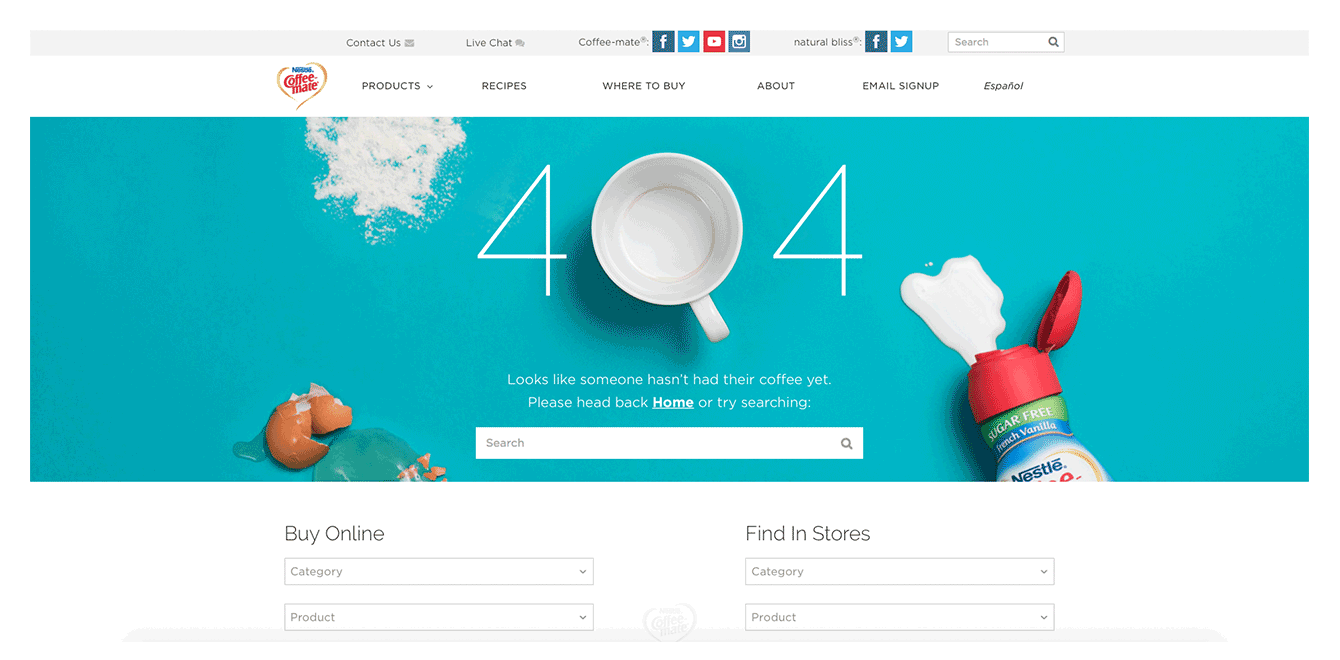
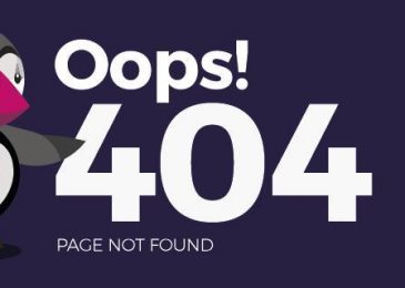
Unfortunately, the scenario happens far more often than you’d hope: potential website visitors click on a link from a search engine or another website and end up on a 404 page – a dead end on the internet. This can be incredibly frustrating–for starters, the content the user was searching for isn’t displaying, but worse yet, the design of the error page is unappealing and bland.
By using an unusual and exciting 404 error page, you can quickly ease the blues of your site visitors. If you surprise your users by using the design of your 404 page to get creative, you can turn a negative into a positive and put a smile on the face of your customers; making them more likely to let you off the hook and keep your site in mind for future visits.
How can you create a good 404 page?
Simply put: Good error pages distinguish themselves through a pleasant visual display and a charming and/or amusing message. The following tips are important to keep in mind:
- Stay true to the style of the website: a good 404 webpage matches the design of its website and the corresponding identity of the company behind it. Make sure that your error displays fit the content, tone, and visuals of your online presence.
- Briefly explain what’s happened to the visitor: not every user is aware of what an error 404 means. Instead of simply writing ‘404 Not Found’ or ‘Error 404: page not found’, you should briefly and simply explain why the user has reached this page. This can be done in a light-hearted, amusing way–often, creative 404 error messages will suggest that the user has been lost in the vast, empty world of the internet forever, or that they were too slow and the content of the webpage has been moved.
- Humor: many of the best 404 pages employ on a humorous and self-deprecating stance on the subject. But it’s important to make sure that this text is only as long as it has to be. Remember that your site visitors have actually been promised other content–so the joke should be quick and to the point. A good way to speed this up would be to use images, animation, gifs, or even short videos to entertain your users.
- Integrate animation or a mini browser game: although they require the most effort, the use of animated or even interactive 404 pages always provides the most entertainment and captures visitor attention.
- Always link back to your homepage: while 404 pages can be good fun, the most important thing is to get your visitors back on track as soon as possible. You should do this by either linking back to your homepage or embedding a search function to allow users to find the page they want on your website.
Top funny, original, or simply just great 404 pages
To help inspire you into finding a great design for your own http 404 error page, we’ve assembled a list of 20 of our favorite examples for you to enjoy below. In the selection, you’ll find charming, quirky, funny, and surprising ideas for implementing a creative 404 page.
Lego
Danish company Lego feature several iconic Lego figures on their error page, each reacting in a different way to the 404 error. This is a good example of how to maintain corporate identity on an error page.
South Park
Cartoon classic South Park follows Lego in the style of its South Park Studios website’s 404 page. The writers feature a character from the show using one of their classic catchphrases. In our example, it’s the turn of Butters, the loveable fourth grader. But they’ve featured Stan, Cartman, Kenny, and Kyle already in the past. Switching things up keeps the page fresh and users entertained.
GitHub
This online service for software developers knows that its audience are likely to be fans of ‘Star Wars’ as well. GitHub play on this on their 404 page by using a classic line from the saga on an interactive Star Wars backdrop that bounces and slides as you move your cursor over it.
Airbnb
Alongside many helpful links, the Airbnb platform for private accommodations offers a short animation of a girl losing her ice cream on their 404 page.
Fork
The online presence for content management system Fork continues their maritime theme (in keeping with the corporate design of their software). Fork’s 404 page tells the user that their page was regrettably lost at sea.
Read more How to fix error 404 Not Found on your website
_______________________________________________________________________________
For more details about our seo service packages, pls contact us
BIGBIGSEO Team
Email: bigbigseo@gmail.com
Skype: bigbigseo
https://www.facebook.com/bigbigseo
Thank you!


